



Skip to content
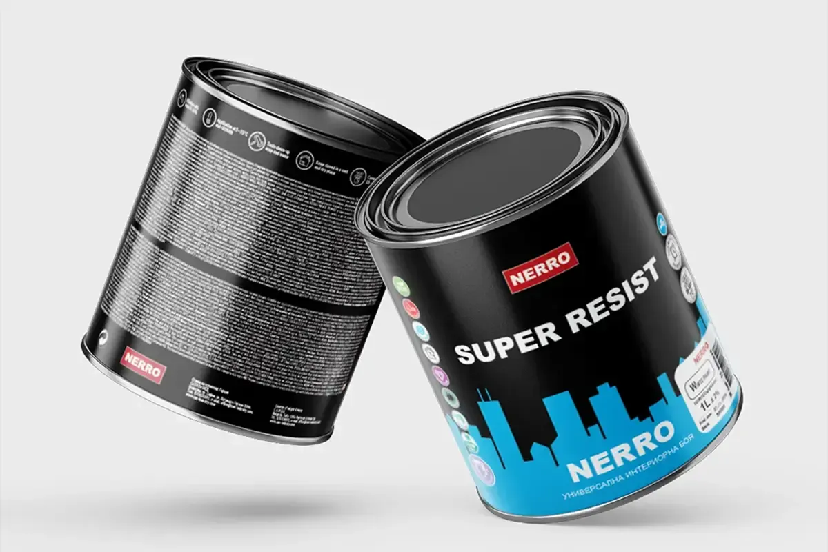
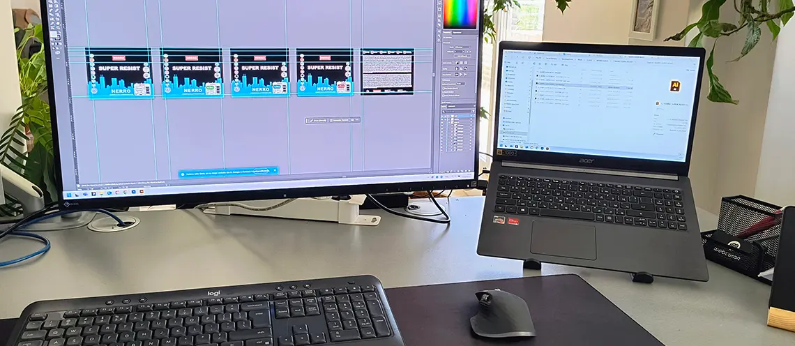
Nerro Super Resist product label for interior paint

Labels for C.A.N.

Adaptation, improvement and print preparation of product labels for C.A.N. Ltd., covering several product lines of paints, primers and decorative coatings - Nerro, ASSOS and Chromatex.

Context

C.A.N. Ltd. assigned work on product labels for several of its paint, primer and decorative coating brands - Nerro, ASSOS and Chromatex. The project was based on a visual foundation provided by the client, which we further developed, refined and prepared for production printing. The work included label adaptation, detail improvements, typography adjustments, file structuring and preparation for future variants and print runs.

Work process for paint, primer and decorative coating labels in Adobe Illustrator

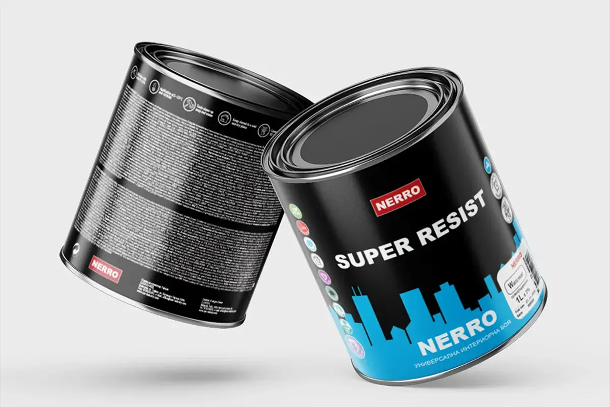
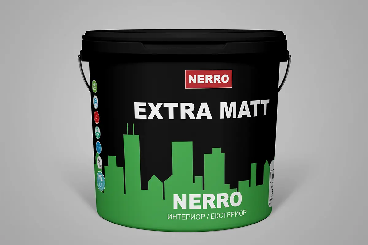
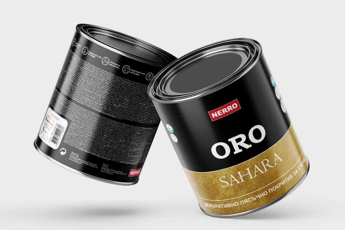
Nerro labels

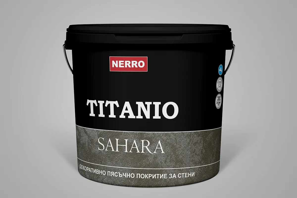
For the Nerro product line, we worked on a cleaner and more premium-oriented visual direction. The black base, strong contrast and color accents help the different products stay recognizable without losing their shared visual connection. For Nerro Super Resist, the emphasis is on a more contemporary urban feel, while for the Sahara decorative coatings the visual direction follows the more material and textured perception of the product.

ASSOS labels

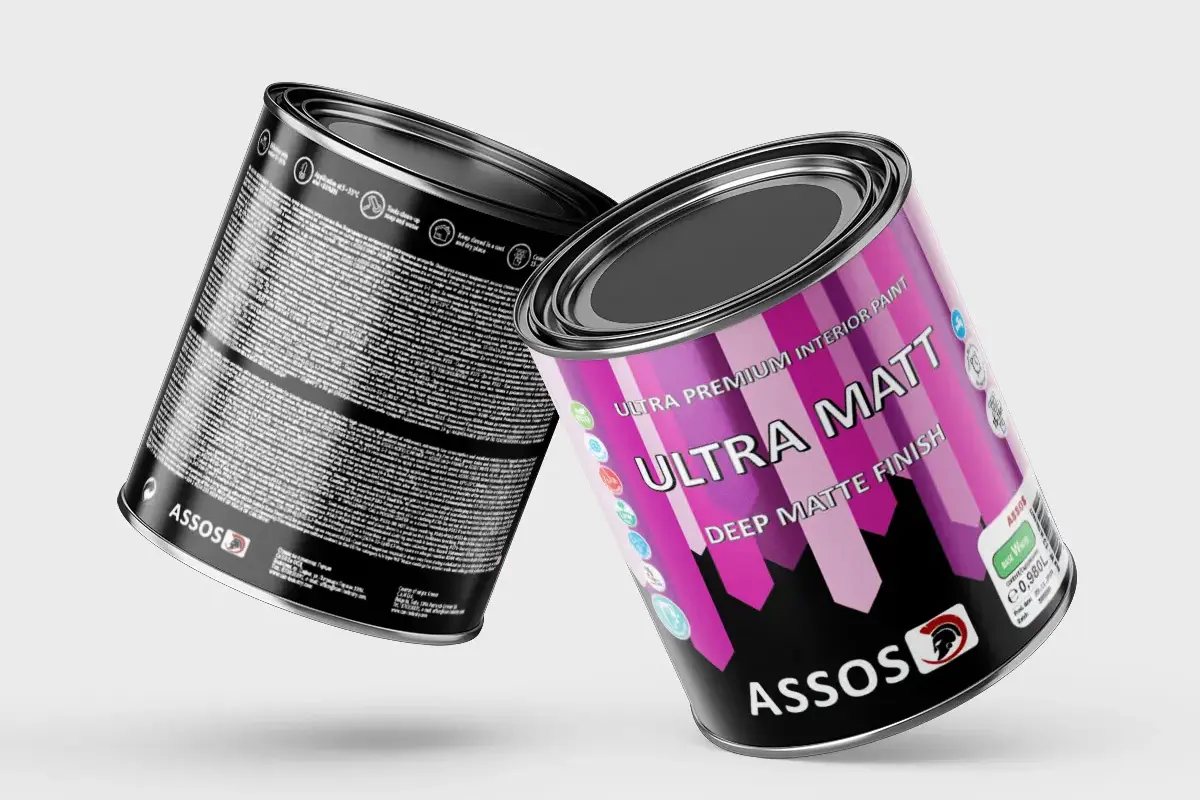
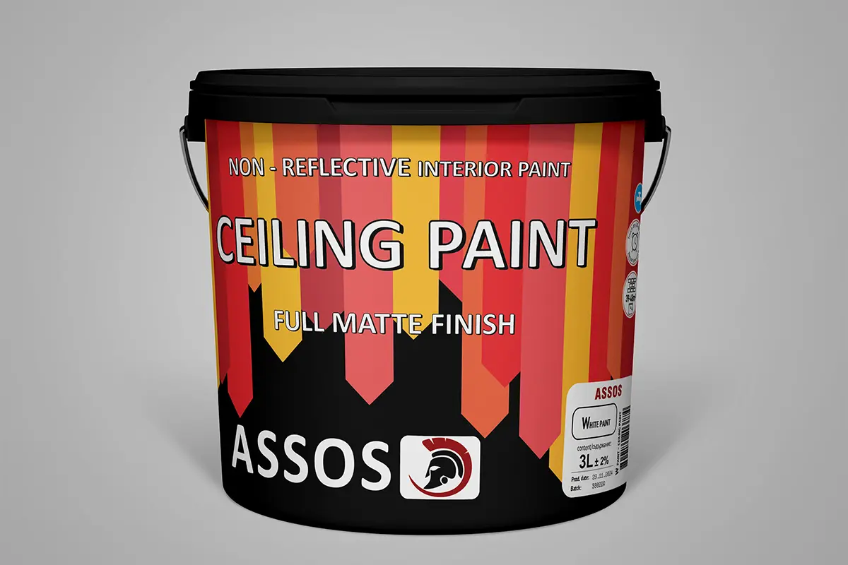
For ASSOS, the task was to preserve the brighter and more direct visual direction while making it more readable and more suitable for print. The labels use saturated colors, geometric shapes and typography with clear contrast, so they remain stable over the active background. This matters both for the individual package and for the overall presentation of the product line.

ASSOS Ultra Matt label for interior paint
ASSOS Ceiling Paint label for interior paint

Chromatex labels

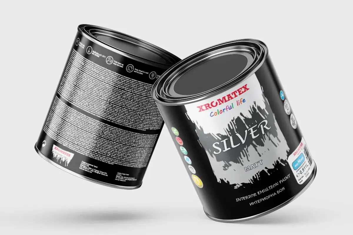
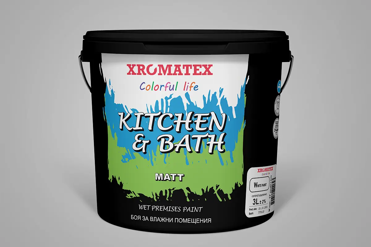
For Chromatex, we applied the same careful approach to adaptation, file structure and visual consistency. The work included typography adjustment based on the length and content of the text, arranging the information and aligning the graphic elements with the character of the product. The goal was for the labels to remain recognizable, functional and convenient for production.

Xromatex Silver Matt label for interior paint
Xromatex Kitchen and Bath label for wet-room paint

What We Achieved

We adapted, improved and prepared product labels for the Nerro, ASSOS and Chromatex lines of C.A.N. Ltd., combining the provided visual foundation with more precise typography, structured print files and a clear system for future product variants and print runs.

Project Info

Ready to Elevate Your Digital Presence?

Let's create a custom strategy that fits your business goals.

Get a Free Consultation
Project team

The people behind the work

These are the people who worked on this project and the role each of them had in the delivery.

Yavor Marinov - graphic designer and WordPress specialist at WebComa

Yavor Marinov

Label adaptation, visual improvements and print preparation
Client Feedback

Real Feedback from Businesses

Our client feedback reflects the way we work — with clarity, responsibility, and a strong focus on real business results. For us, a successful project is not just a website that looks good, but a reliable and effective solution that improves processes, saves time, and helps businesses grow with confidence.

Related Projects

Similar Success Stories

Explore other projects in the same category and see how we help businesses achieve their digital goals.

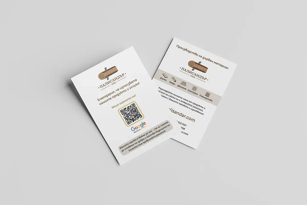
Double-sided A6 flyers for Palisandar Ltd with QR codes to the website and Google Reviews shown as a printed mockup

A6 Flyers with a QR Code to Google Reviews for Palisandar

Double-sided A6 flyers with a QR code to Google Reviews for a wood material and wooden products manufacturer.

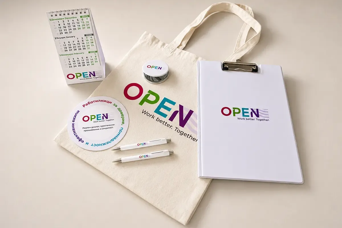
Set of corporate and promotional materials for OPEN by TSA

Corporate and promotional materials for OPEN by TSA

A full set of printed and promotional materials for OPEN by TSA, applied consistently across different formats.